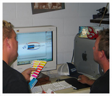
Logo Design
Company Logos are a very important for your company identity. Your logo should be simple, legible and easy to remember. When customers see it they know exactly who you are and what you sell.
The best idea is to hire a professional. We know the do's and don't's of good design. Our signs and graphics team can take care of all your logo needs, signs and designs for you.
CLICK HERE to see some of our logos.
Tips to remember
Design.
Keep it simple. There is no need to over crowd the logo with unnecessary elements. Keep the focus on legibility and simplicity. What a novice designer may do, is render tons of effects to a font, bevel it, add a drop shadow and an outline, maybe a set of flames or an American flag, and call it a logo. Realistically, the logo will never reproduce correctly, is to hard to remember and is difficult to read. The simpler the better. Think about the Apple logo or Nike. These are world renown logos, and everyone can remember them. They are also one single color.
Colors.
Use no more than three colors. One or two colors is even better if you can. Remember that you are going to reproduce this logo, and would like it to be consistent everytime. One or two colors can be monitored fairly easy. And again a simple logo makes a better impression.
When choosing colors, choose colors that fit your business. For example if you company was called, "Ocean." you wouldn't choose Red.
Typography.
Try to avoid "Brush Script, "Comic Sans" and "Old English". Choose a font that is legible yet somewhat original, even if it means you must pay for it. The logotype is very important.
Try to avoid skewing type.
The default proportions are the most legible. The whole idea of a logo, is to be able to read it. When we stretch it up or sideways, we are making it less legible.
Branding.
Have your logo trade marked and branded by a proffesional. This insures that all of your reproduction will maintain continuity. There is no sense paying for a logo if it is not consistant.
CLICK HERE to see some of our logos.
|

